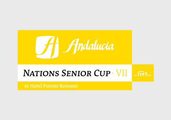
The name of the worlds biggest senior tournament by nations was also the name of the company who organize them, (Nations Senior Cup) so, the choice was to develop only one brand for the company but for each event, the brand will add the number of the edition in the case of the tournament (inside the white rectangle of the brand) and in some cases like posters, etc. the brand shows some blocks with more information: main sp
onsor (up) or ITF logo (right) or place (down) or all of them as in the image.
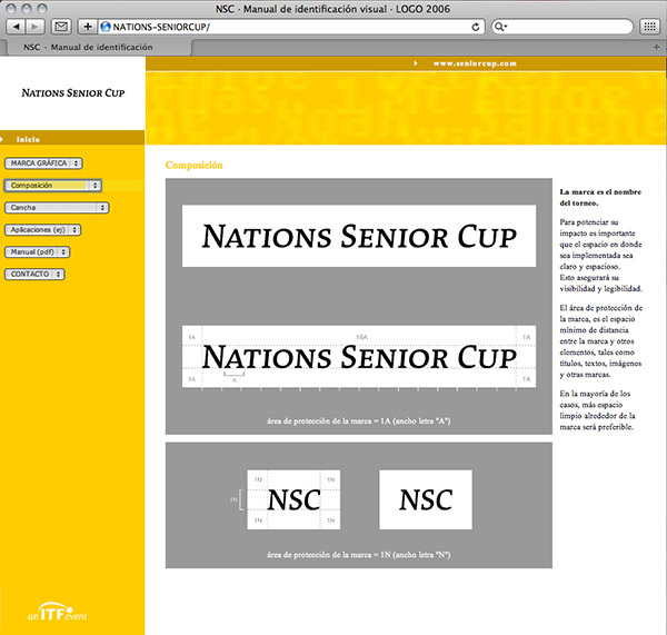
I also developed a website with the brand guidelines of the ITF Nations Seniors Cup. This web site also included a proposal based in a study about colours of the sides of the tennis courts in all tennis tournaments. This study was then the base for defining the grey colour of the following tournament developed by the same company, the Masters Senior Comunidad de Madrid. After a first successful edition of this Masters, were I apply the proposal, it “inspire” the ATP Madrid Open who change their sides, turning radically from blue to a similar grey… I am still waiting for salutations from Tiriac :¬)
ITF = International Tennis Federation.