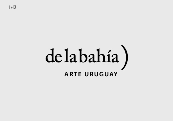
Art gallery name and brand I developed for own client when I was working at i+D design (www.id.net.uy).
The open parenthesis of the right among other connotations, has the same curve than the bay (bahía) where this gallery was located.
“de la bahía)” literally means “from (or ‘of’) the bay”.
The noun is omitted (should be the word “gallery”) but it is added naturally by the people when they refer to the place.
This emphasizes the idea of open and participative, intrinsic attributes of art.
But in other hand the classic design (color, font, structure) reveals the idea of the kind of art the gallery works with.
The second line ARTE URUGUAY, helps locals and foreigns to understand the topic this brand is related with, of course the location of it, and that was a gallery of fine art just from Uruguay.
This gallery was open from 2003 to 2007 in Montevideo and during all its existence I develop their visual communication and also curatorial work, production and mounting of exhibitions, website, graphic items for administration (inventory, etc).